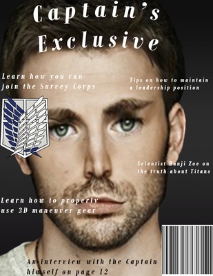
The articles I featured are more based around the show Attack on Titan. This is because I morphed Chris Evans into a person from Attack on Titan, and it just made sense to me to make it loosely based off the show. I also know more about Attack on Titan than I do Chris Evans/Captain America.
There is one article that relates to both Chris Evans and Erwin Smith. It's the "Learn how to maintain a leadership position". Chris Evans portrays Captain America who leads the army, and Erwin Smith is the leader of the Survey Corps in Attack on Titan. The title of my magazine relates to my character because both of the people I used are captains or have played as a captain.  I decided to warp Chris Evans and Erwin Smith from Attack on Titan together. I picked these two because they looked fairly similar to each other. They also play "captains". Chris Evans plays Captain American and Erwin Smith is an actual military leader. I honestly didn't like doing this project at all.
I only feel pressured to look a certain way sometimes. Most of the time I really don't care what I look like, but then I'll see something and immediately feel self conscious for a few days. I feel like the media pressures teens to look a way that's almost impossible since most models end up getting photoshopped anyway. Most people in reality could care less what you look like. 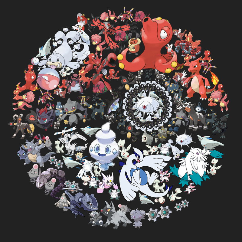
196 layers later and I finally finished. I decided to create a pokeball out of Pokemon characters. I thought it would be cool to make it out of the actual characters instead of random things. If I could change one thing I would definitely try to fill in some of the negative space between characters. I also realized after I finished that i never actually went all the way around with the gray area at the bottom.
I found it difficult to find spaces to put all the images together. It was also hard to find characters that actually fit the spaces they were supposed to go into. When I first began to work on this project I couldn't figure out how to get rid of the background of certain images but I eventually figured it out. 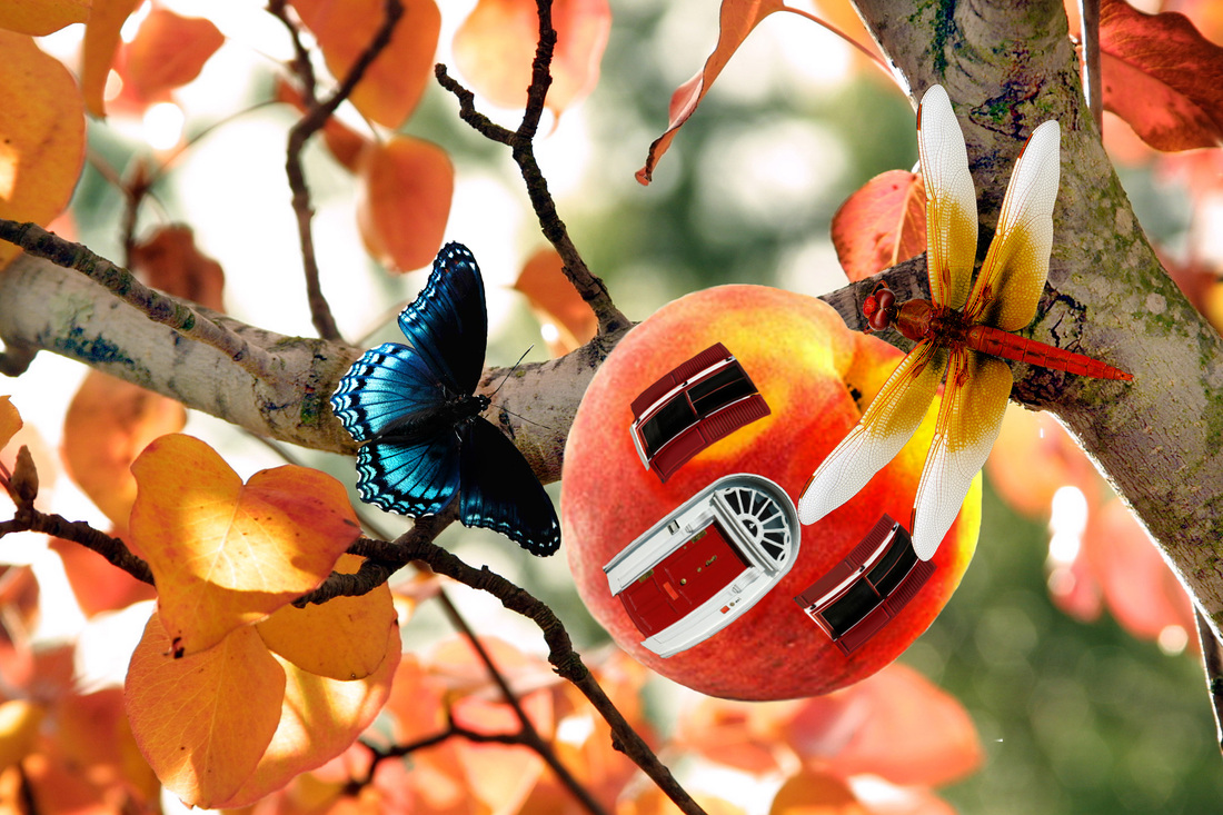
This is for the edible architecture project. I decided that I would like bugs such as dragonflies and butterflies to live inside the peach house. The background looked nice with the color of the peach so I decided to use those two together. I also decided to have a dragonfly that stuck with the orange theme. The butterfly is blue because I thought the image needed contrast against the orange. The windows and door are red because the also go with the colors of the peach.
I added shadows and highlights on the peach although you can't really tell where the shadows are. I also added shadows to the dragonfly and butterfly to make it seem more realistic. I then added shadows to the areas of the tree where the peach, dragonfly, and butterfly are. I tried adding shadows to the windows and the door but you can't really tell because of how small they are on the peach.  This is from the tutorial where we had to change the color of an image.
| AuthorWrite something about yourself. No need to be fancy, just an overview. ArchivesJanuary 2015 Categories |

 RSS Feed